Plotting Functions
Docs / Development
Visualising your data
Plotting Functions
MultiQC plotting functions are held within multiqc.plots submodules.
To use them, simply import the modules you want, e.g.:
from multiqc.plots import bargraph, linegraphOnce you’ve done that, you will have access to the corresponding plotting functions:
from multiqc.plots import bargraph, linegraph, scatter, table, violin, heatmap, box
bargraph.plot(data=..., cats=..., pconfig=...)
linegraph.plot(data=..., pconfig=...)
scatter.plot(data=..., pconfig=...)
table.plot(data=..., headers=..., pconfig=...)
violin.plot(data=..., headers=..., pconfig=...)
heatmap.plot(data=..., xcats=..., ycats=..., pconfig=...)
box.plot(list_of_data_by_sample=..., pconfig=...)
These have been designed to work in a similar manner to each other - you pass a data structure to them, along with optional extras such as categories and configuration options, and they return a string of HTML to add to the report. You can add this to the module introduction or sections as described above. For example:
from multiqc.plots import bargraph
from multiqc import BaseMultiqcModule

class MultiqcModule(BaseMultiqcModule):
    def __init__(self):
        super().__init__(...)
        data = ...
        self.add_section(
            name="Module Section",
            anchor="mymod_section",
            description="This plot shows some really nice data.",
            helptext="This longer string (can be **markdown**) helps explain how to interpret the plot",
            plot=bargraph.plot(data, cats=..., pconfig=...)
        )
Common options
All plots should as a minimum have a config with an id and a title.
MultiQC is written to work with sensible defaults, so won’t complain if you
don’t supply these, but it’s good practice for usability (the ID is used as
a filename when exporting plots, and all plots should have a title when exported).
Plot titles should use the format Module name: Plot name (this is partly for ease of use within MegaQC and other downstream tools).
Bar graphs
Simple data can be plotted in bar graphs. Many MultiQC modules make use
of stacked bar graphs. Here, the bargraph.plot() function comes to
the rescue. A basic example is as follows:
from multiqc.plots import bargraph
data = {
    'sample 1': {
        'aligned': 23542,
        'not_aligned': 343,
    },
    'sample 2': {
        'not_aligned': 7328,
        'aligned': 1275,
    }
}
html = bargraph.plot(data, pconfig=...)
To specify the order of categories in the plot, you can supply a list of dictionary keys. This can also be used to exclude a key from the plot.
from multiqc.plots import bargraph
cats = ['aligned', 'not_aligned']
html = bargraph.plot(..., cats, pconfig=...)
If cats is given as a dict instead of a list, you can specify a nice name
and a colour too:
cats = {
    "aligned": {
        'name': 'Aligned Reads',
        'color': '#8bbc21'
    },
    "not_aligned": {
        'name': 'Unaligned Reads',
        'color': '#f7a35c'
    }
}
Finally, a third variable should be supplied with configuration variables for the plot. The defaults are as follows:
config = {
    # Building the plot
    "id": "<random string>",                  # HTML ID used for the plot
    "cpswitch": True,                         # Show the 'Counts / Percentages' switch?
    "cpswitch_c_active": True,                # Initial display with 'Counts' specified? False for percentages.
    "cpswitch_counts_label": "Counts",        # Label for 'Counts' button
    "cpswitch_percent_label": "Percentages",  # Label for 'Percentages' button
    "logswitch": False,                       # Show the 'Log10' switch?
    "logswitch_active": False,                # Initial display with 'Log10' active?
    "logswitch_label": "Log10",               # Label for 'Log10' button
    "hide_zero_cats": True,                   # Hide categories where data for all samples is 0
    # Customising the plot
    "title": None,                            # Plot title - should be in format "Module Name: Plot Title"
    "ylab": None,                             # Y axis label
    "ymax": None,                             # Max bar size limit (default is calculated from data)
    "xsuffix": "%",                           # Suffix for the X-axis values and labels. Parsed from tt_label by default
    "tt_label": "{x}: {y:.2f}%",              # Customise tooltip label, e.g. '{point.x} base pairs'
    "stacking": "relative",                   # Set to "group" to have category bars side by side
    "tt_decimals": 0,                         # Number of decimal places to use in the tooltip number
    "tt_suffix": "",                          # Suffix to add after tooltip number
    "height": 500                             # The default height of the plot, in pixels
}The keys id and title should always be passed as a minimum.
The id is used for the plot name when exporting.
If left unset the Plot Export panel will call the filename
mqc_hcplot_gtucwirdzx.png (with some other random string).
Plots should always have titles, especially as they can stand by themselves
when exported. The title should have the format Modulename: Plot Name
Switching datasets
It’s possible to have single plot with buttons to switch between different
datasets. To do this, give a list of data objects to the plot function
and specify the data_labels config option with the text to be used for the buttons:
from multiqc.plots import bargraph
pconfig = {
    'data_labels': ['Reads', 'Bases']
}
data1 = ...
data2 = ...
html = bargraph.plot([data1, data2], pconfig=pconfig)
You can also customise any plot configuration per-dataset, for example, the y-axis label, min/max values, or title:
pconfig = {
    "data_labels": [
        {
            "name": "Reads",  # Button label
            "ylab": "Reads",  # Y-axis label
        },
        {
            "name": "Base Pairs",
            "ylab": "Base Pairs",
            "ymax": 100,
            "title": "Number of Base Pairs",  # Plot title
        },
    ]
}
If supplying multiple datasets, you can also supply a list of category objects. Make sure that they are in the same order as the data.
Categories should contain data keys, so if you’re supplying a list of two datasets, you should supply a list of two sets of keys for the categories. MultiQC will try to guess categories from the data keys if categories are missing.
For example, with two datasets supplied as above:
cats = [
    ["aligned_reads", "unaligned_reads"],
    ["aligned_base_pairs", "unaligned_base_pairs"],
]
Or with additional customisation such as name and colour:
from multiqc.plots import bargraph
cats = [
    {
        "aligned_reads": {"name": "Aligned Reads", "color": "#8bbc21"},
        "unaligned_reads": {"name": "Unaligned Reads", "color": "#f7a35c"},
    },
    {
        "aligned_base_pairs": {"name": "Aligned Base Pairs", "color": "#8bbc21"},
        "unaligned_base_pairs": {"name": "Unaligned Base Pairs", "color": "#f7a35c"},
    },
]
data = ...
html = bargraph.plot([data, data], cats, pconfig=...)
Note that, as in this example, the plot data can be the same dictionary supplied twice.
Line graphs
This base function works much like the above, but for two-dimensional
data, to produce line graphs. It expects a dictionary with sample identifiers,
each containing numeric x:y points. For example:
from multiqc.plots import linegraph
data = {
    "sample 1": {
        "<x val 1>": "<y val 1>",
        "<x val 2>": "<y val 2>",
    },
    "sample 2": {
        "<x val 1>": "<y val 1>",
        "<x val 2>": "<y val 2>",
    },
}

html = linegraph.plot(data)
Additionally, a configuration dict can be supplied. The defaults are as follows:
from multiqc.plots import linegraph
pconfig = {
    # Building the plot
    "id": "<random string>",     # HTML ID used for plot
    "categories": False,         # Set to True to use x values as categories instead of numbers.
    "colors": dict(),            # Provide dict with keys = sample names and values colours
    "smooth_points": None,       # Supply a number to limit number of points / smooth data
    "smooth_points_sumcounts": True,  # Sum counts in bins, or average? Can supply list for multiple datasets
    "logswitch": False,          # Show the 'Log10' switch?
    "logswitch_active": False,   # Initial display with 'Log10' active?
    "logswitch_label": "Log10",  # Label for 'Log10' button
    "extra_series": None,        # See section below
    # Plot configuration
    "title": None,               # Plot title - should be in format "Module Name: Plot Title"
    "xlab": None,                # X axis label
    "ylab": None,                # Y axis label
    "xmax": None,                # Hard max x limit
    "xmin": None,                # Hard min x limit
    "ymax": None,                # Hard max y limit
    "ymin": None,                # Hard min y limit
    "x_clipmax": None,           # Max value allowed for automatic axis limit
    "x_clipmin": None,           # Min value allowed for automatic axis limit
    "y_clipmax": None,           # Max value allowed for automatic axis limit
    "y_clipmin": None,           # Min value allowed for automatic axis limit
    "x_minrange": None,          # Min range for x-axis (5 would allow 0..5, but also 15..20, etc.)
    "y_minrange": None,          # Min range for y-axis (5 would allow 0..5, but also 15..20, etc.)
    "xlog": False,               # Use log10 for the x-axis
    "ylog": False,               # Use log10 scale for the y-axis
    "y_bands": None,             # Horizontal colored background bands
    "x_bands": None,             # Vertical colored background bands
    "y_lines": None,             # Extra horizontal lines
    "x_lines": None,             # Extra vertical lines
    "xsuffix": "%",              # Suffix for the X-axis values and labels. Parsed from tt_label by default
    "ysuffix": "%",              # Suffix for the Y-axis values and labels. Parsed from tt_label by default
    "tt_label": "{x}: {y:.2f}",  # Customise tooltip label, e.g. '{point.x} base pairs'
    "tt_decimals": None,         # Tooltip decimals when categories = True (when false use tt_label)
    "height": 500,               # The default height of the plot, in pixels
    "style": "line",             # The style of the line. Can be "line" or "lines+markers"
}
html = linegraph.plot(..., pconfig)The keys id and title should always be passed as a minimum.
The id is used for the plot name when exporting.
If left unset the Plot Export panel will call the filename
mqc_hcplot_gtucwirdzx.png (with some other random string).
Plots should always have titles, especially as they can stand by themselves
when exported. The title should have the format Modulename: Plot Name
X-axis format
Plotly will try to automatically parse the X-axis values. Strings that look like a
number will be interpreted as numbers (e.g. "13" and "2.0" will turn into 13 and 2.0
and get ordered numerically: 2.0, 13); dates in ISO format will be parsed as datestamps
(e.g. "2021-01-01" will turn into a datetime object and ordered chronologically).
If you want to force the X-axis to be treated as plain strings, set categories=True in the plot config.
Switching datasets
You can also have a single plot with buttons to switch between different datasets. To do this, just supply a list of data dicts instead (same formats as described above). For example:
data = [
    {
        "sample 1": {"<x val 1>": "<y val 1>", "<x val 2>": "<y val 2>"},
        "sample 2": {"<x val 1>": "<y val 1>", "<x val 2>": "<y val 2>"},
    },
    {
        "sample 1": {"<x val 1>": "<y val 1>", "<x val 2>": "<y val 2>"},
        "sample 2": {"<x val 1>": "<y val 1>", "<x val 2>": "<y val 2>"},
    },
]
You’ll also want to add the following configuration options to give names to the buttons and graph labels:
config = {
    "data_labels": [
        {
            "name": "DS 1",  # Button label
            "ylab": "y axis 1",  # Y-axis label
            "xlab": "x axis 1",  # X-axis label
        },
        {
            "name": "DS 2",
            "ylab": "y axis 2",
            "xlab": "x axis 2",
        },
    ]
}
All of these config values are optional, the function will default to sensible values if things are missing.
Additional data series
Sometimes, it’s good to be able to specify specific data series manually.
To do this, use config['extra_series']. For a single extra line this can
be a dict (as below). For multiple lines, use a list of dicts. For multiple
dataset plots, use a list of list of dicts.
For example, to add a dotted x = y reference line:
from multiqc.plots import linegraph
max_x_val = ...
max_y_val = ...
pconfig = {
    "extra_series": {
        "name": "x = y",
        "data": [[0, 0], [max_x_val, max_y_val]],
        "dash": "dash",
        "width": 1,
        "color": "#000000",
        "marker": {"enabled": False},
        "showlegend": False,
    }
}
html = linegraph.plot(..., pconfig)
Box plots
Box plots take similar data structure as line plots, but better visualize the underlying data distribution by emphasizing quartiles, mean, median, standard deviation, the extreme values and the outliers.
Instead of x
pairs, the box plot take a flat list of points for each sample:from multiqc.plots import box
data = {
"sample 1": [9, 1, 2, 3, 4, 5, 6, 7, 8, 9, 10],
"sample 2": [2, 4, 6, 6, 6, 10, 0, 1],
}
html = box.plot(data, pconfig=...)Similarly to other plot types, multiple datasets can be passed as data, along with
dataset-specific configurations provided with the pconfig["data_labels"] option.
Scatter Plots
Scatter plots work in almost exactly the same way as line plots. Most (if not all) config options are shared between the two. The data structure is similar but not identical:
from multiqc.plots import scatter
data = {
    "sample 1": {
        "x": "<x val>",
        "y": "<y val>",
    },
    "sample 2": {
        "x": "<x val>",
        "y": "<y val>",
    },
}
html = scatter.plot(data)
Note that you must use the keys x and y for each data point.
If you want more than one data point per sample, you can supply a list of dictionaries instead. You can also optionally specify point colours and sample name suffixes (these are appended to the sample name):
data = {
    "sample 1": [
        {"x": "<x val>", "y": "<y val>", "color": "#a6cee3", "name": "Type 1"},
        {"x": "<x val>", "y": "<y val>", "color": "#1f78b4", "name": "Type 2"},
    ],
    "sample 2": [
        {"x": "<x val>", "y": "<y val>", "color": "#b2df8a", "name": "Type 1"},
        {"x": "<x val>", "y": "<y val>", "color": "#33a02c", "name": "Type 2"},
    ],
}
Remember that MultiQC reports can contain large numbers of samples, so this plot type is not suitable for large quantities of data - 20,000 genes might look good for one sample, but when someone runs MultiQC with 500 samples, it will crash the browser and be impossible to interpret.
See the documentation about line plots for most config options. The scatter plot has a handful of unique ones in addition:
pconfig = {
    "square": False,  # Force the plot to stay square? (Maintain aspect ratio)
    "xmin": None,  # Hard min x limit
    "xmax": None,  # Hard max x limit
    "ymin": None,  # Hard min y limit
    "ymax": None,  # Hard max y limit
    "x_clipmin": None,  # Min value allowed for automatic axis limit
    "x_clipmax": None,  # Max value allowed for automatic axis limit
    "y_clipmin": None,  # Min value allowed for automatic axis limit
    "y_clipmax": None,  # Max value allowed for automatic axis limit
}
Creating a table
Tables should work just like the functions above (most like the bar graph function). As a minimum, the function takes a dictionary containing data - the first keys will be sample names (row headers) and each key contained within will be a table column header.
You can also supply a list of key names to restrict the data in the table to certain keys / columns. This also specifies the order that columns should be displayed in.
For more customisation, the headers can be supplied as a dictionary. Each key should match the keys used in the data dictionary, but values can customise the output.
Finally, the function accepts a config dictionary as a third parameter. This can set global options for the table (e.g. a title) and can also hold default values to customise the output of all table columns.
The default header keys are:
single_header = {
    "namespace": "",                 # Name for grouping. Prepends desc and is in Config Columns modal
    "title": "[ dict key ]",         # Short title, table column title
    "description": "[ dict key ]",   # Longer description, goes in mouse hover text
    "max": None,                     # Minimum value in range, for bar / colour coding
    "min": None,                     # Maximum value in range, for bar / colour coding
    "ceiling": None,                 # Maximum value for automatic bar limit
    "floor": None,                   # Minimum value for automatic bar limit
    "minrange": None,                # Minimum range for automatic bar
    "scale": "GnBu",                 # Colour scale for colour coding. False to disable.
    "bgcols": None,                  # Dict with values: background colours for categorical data.
    "colour": "<auto>",              # Colour for column grouping
    "suffix": None,                  # Suffix for value (e.g. '%')
    "format": "{:,.1f}",             # Value format string - default 1 decimal place
    "cond_formatting_rules": None,   # Rules for conditional formatting table cell values - see docs below
    "cond_formatting_colours": None, # Styles for conditional formatting of table cell values
    "shared_key": None,              # See below for description
    "modify": None,                  # Lambda function to modify values
    "hidden": False,                 # Set to True to hide the column on page load
}
A third parameter can be specified with settings for the whole table:
table_config = {
    "namespace": "",                           # Name for grouping. Prepends desc and is in Config Columns modal
    "id": "<string>",                          # ID used for the table
    "title": "<table title>",                  # Title of the table. Used in the column config modal
    "save_file": False,                        # Whether to save the table data to a file
    "raw_data_fn": "multiqc_<table_id>_table", # File basename to use for raw data file
    "sort_rows": True,                         # Whether to sort rows alphabetically
    "only_defined_headers": True,              # Only show columns that are defined in the headers config
    "col1_header": "Sample Name",              # The header used for the first column
    "no_violin": False,                        # Force a table to always be plotted (beeswarm by default if many rows)
}
Most of the header keys can also be specified in the table config
(namespace, scale, format, colour, hidden, max, min, ceiling, floor, minrange, shared_key, modify).
These will then be applied to all columns prior to applying column-specific heading config.
A very basic example of creating a table is shown below:
from multiqc.plots import table
data = {
    "sample 1": {
        "aligned": 23542,
        "not_aligned": 343,
    },
    "sample 2": {
        "aligned": 1275,
        "not_aligned": 7328,
    },
}
html = table.plot(data, headers=..., pconfig=...)
A more complicated version with ordered columns, defaults and column-specific settings (e.g. no decimal places):
from multiqc.plots import table
from multiqc import config
data = {
    "sample 1": {
        "aligned": 23542,
        "not_aligned": 343,
        "aligned_percent": 98.563952271,
    },
    "sample 2": {
        "aligned": 1275,
        "not_aligned": 7328,
        "aligned_percent": 14.820411484,
    },
}
headers = {
    "aligned_percent": {
        "title": "% Aligned",
        "description": "Percentage of reads that aligned",
        "suffix": "%",
        "max": 100,
        "format": "{:,.0f}",  # No decimal places please
    },
    "aligned": {
        "title": "Aligned",
        "description": f"Aligned Reads ({config.read_count_desc})",
        "shared_key": "read_count",
        "suffix": f" {config.read_count_prefix}",
        "modify": lambda x: x * config.read_count_multiplier,
    },
    "config": {
        "namespace": "My Module",
        "min": 0,
        "scale": "GnBu",
    },
}
html = table.plot(data, headers=headers, pconfig=...)
Table decimal places
You can customise how many decimal places a number has by using the format config
key for that column. The default format string is "{:,.1f}", which specifies a
float number with a single decimal place. To remove decimals use "{:,d}".
To have two decimal places, use "{:,.2f}".
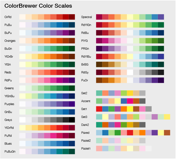
Table colour scales
Colour scales are taken from ColorBrewer2.
Colour scales can be reversed by adding the suffix -rev to the name. For example, RdYlGn-rev.
The following scales are available:
Custom cell background colours
You can specify custom background colours for specific values using the bgcols
header config. This takes precedence over scale.
For example, a header config for a column could look like this:
headers = {
    "col": {
        "title": "My table column",
        "bgcols": {
            "bad data": "#f8d7da",
            "ok data": "#fff3cd",
            "good data": "#d1e7dd"
        }
    }
}
Zero centrepoints
If you set the header config bars_zero_centrepoint to True, the background bars
will use the absolute values to calculate bar width. So a value of 0 will have a bar
width of 0, 20 a width of 20 and -30 a width of 30.
This works well with a divergent colour-scheme as the bar width shows the magnitude of the value properly, whilst the colour scheme shows the difference between positive and negative values.
For example:
headers = {
    "col": {
        "title": "My table column",
        "scale": "RdYlGn",
        "bars_zero_centrepoint": True,
    }
}
Conditional formatting of data values
MultiQC has configuration options to allow users to configure “Conditional formatting”, with highlighted values in table cells.
Developers can also make use of this functionality within the header config dictionaries for formatting data values.
The functionality follows the same logic as for user configs with the parameters
cond_formatting_rules and cond_formatting_colours. These correspond to the
user config options table_cond_formatting_rules and table_cond_formatting_colours,
with the exception that no column ID is needed for table_cond_formatting_rules.
For example, a simple header config could look as follows:
headers = {
    "col": {
        "title": "My table column",
        "cond_formatting_rules": {
            "pass": [{"s_eq": "good data"}],
            "warn": [{"s_eq": "ok data"}],
            "fail": [{"s_eq": "bad data"}],
        }
    }
}
A more complex version with multiple rules could be:
headers = {
    "col": {
        "title": "My table column",
        "cond_formatting_rules": {
            "brightgreen": [
                {"s_contains": "amazing"},
                {"s_contains": "incredible"},
            ],
            "brown": [{"s_ne": "rubbish-data"}],
            "turquoise": [
                {"gt": 4},
                {"lt": 12},
            ],
        },
        "cond_formatting_colours": [
            {"brightgreen": "#39FF14"},
            {"brown": "#A52A2A"},
            {"turquoise": "#30D5C8"},
        ]
    }
}
Specifying sorting of columns
By default, each table is sorted by sample name alphabetically. You can override the
sorting order using the defaultsort option. Here is an example:
custom_plot_config:
  general_stats_table:
    defaultsort:
      - column: "Mean Insert Length"
        direction: asc
      - column: "Starting Amount (ng)"
  quast_table:
    defaultsort:
      - column: "Largest contig"
In this case, the general stats table will be sorted by “Mean Insert Length” first,
in ascending order, then by “Starting Amount (ng)”, in descending (default) order. The
table with the ID quast_table (which you can find by clicking the “Configure Columns”
button above the table in the report) will be sorted by “Largest contig”.
Violin plots
Violin plots work from the exact same data structure as tables, so the usage is just the same. Moreover, a for every table, a switch button is available to view a corresponding violin plot for the underlying data.
from multiqc.plots import violin
data = {
    "sample 1": {
        "aligned": 23542,
        "not_aligned": 343,
    },
    "sample 2": {
        "not_aligned": 7328,
        "aligned": 1275,
    },
}
html = not violin.plot(data, headers=..., pconfig=...)
The function also accepts the same headers and config parameters.
Heatmaps
Heatmaps expect data in the structure of a list of lists. Then, a list of sample names for the x-axis, and optionally for the y-axis (defaults to the same as the x-axis).
from multiqc.plots import heatmap
heatmap.plot(data=..., xcats=..., ycats=..., pconfig=...)
A simple example:
from multiqc.plots import heatmap
data = [
    [0.9, 0.87, 0.73, 0.6, 0.2, 0.3],
    [0.87, 1, 0.7, 0.6, 0.9, 0.3],
    [0.73, 0.8, 1, 0.6, 0.9, 0.3],
    [0.6, 0.8, 0.7, 1, 0.9, 0.3],
    [0.2, 0.8, 0.7, 0.6, 1, 0.3],
    [0.3, 0.8, 0.7, 0.6, 0.9, 1],
]
names = ["one", "two", "three", "four", "five", "six"]
html = heatmap.plot(data, xcats=names, pconfig=...)
Alternatively you can supply a dictionary of dictionaries, in which case xcats and ycats are optional:
data = {
    "sample 1": {
        "one": 0.9,
        "two": 0.87,
        "three": 0.73,
        "four": 0.6,
        "five": 0.2,
    },
    "sample 2": {
        "two": 1,
        "three": 0.7,
        "four": 0.6,
        "six": 0.3,
    },
}
from multiqc.plots import heatmap
html = heatmap.plot(data, pconfig=...)
Much like the other plots, you can change the way that the heatmap looks using a config dictionary:
pconfig = {
    "title": None,                 # Plot title - should be in format "Module Name: Plot Title"
    "xlab": None,                  # X-axis title
    "ylab": None,                  # Y-axis title
    "zlab": None,                  # Z-axis title, shown in the hover tooltip
    "min": None,                   # Minimum value (when unset, derived automatically)
    "max": None,                   # Maximum value (when unset, derived automatically)
    "square": True,                # Force the plot to stay square? (maintain aspect ratio)
    "xcats_samples": True,         # Is the x-axis sample names? Set to "False" to prevent report toolbox from affecting.
    "ycats_samples": True,         # Is the y-axis sample names? Set to "False" to prevent report toolbox from affecting.
    "colstops": [],                # Scale colour stops. See below.
    "reverse_colors": False,        # Reverse the order of the colour axis
    "tt_decimals": 2,              # Number of decimal places for tooltip
    "legend": True,                # Colour axis key enabled or not
    "display_values": True,        # Show values in each cell. Defaults True when less than 20 samples.
    "height": 500                  # The default height of the interactive plot, in pixels
}
The colour stops are a bit special and can be used to define a custom colour
scheme. These should be defined as a list of lists, with a number between 0 and 1
and a HTML colour. The default is RdYlBu from ColorBrewer:
pconfig = {
    "colstops": [
        [0, "#313695"],
        [0.1, "#4575b4"],
        [0.2, "#74add1"],
        [0.3, "#abd9e9"],
        [0.4, "#e0f3f8"],
        [0.5, "#ffffbf"],
        [0.6, "#fee090"],
        [0.7, "#fdae61"],
        [0.8, "#f46d43"],
        [0.9, "#d73027"],
        [1, "#a50026"],
    ]
}
Interactive / Flat image plots
Note that the all plotting functions except for table can generate both interactive
JavaScript-powered report plots and flat image plots. This choice is made
depending on the presence of the --flat (config.plots_flat) flag.
Note that both plot types should come out looking pretty much identical. If you spot something that’s missing in the flat image plots, let me know.